Новая серия коллажей Ах как хочется цвета!
9.01.2011
Новая серия коллажей И все они - Любовь
28.12.2010
Новая серия коллажей Звонкие звезды
 |
Новости
20.02.2011 Новая серия коллажей Ах как хочется цвета! 9.01.2011 Новая серия коллажей И все они - Любовь 28.12.2010 Новая серия коллажей Звонкие звезды
|
В Центральном музее связи имени А.С.Попова подготовлен курс лекций на тему: «Всемирный почтовый дизайн», рассказывающий об основных художественных стилях, таких как неоклассицизм, эклектика, модерн, Ар деко, функционализм-конструктивизм и других, повлиявших на оформление почтовых документов. Курс рассчитан на широкий круг посетителей. Лекции читает искусствовед, переводчик, член Международной ассоциации искусствоведов - Дьяченко Андрей Петрович.
далее Персоны Весь список Искусство Весь список Открытки О сайте 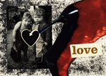
Открытки без повода!
МЭЙЛ-АРТ искусство создания художественно оформленных почтовых отправлений, окрашенных личностью автора
|
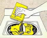
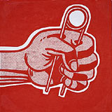
Roy Lichtenstein. Interview 1997
David Sylvester: There are times, like the second half of the eighteenth century, when a lot of the best art of a period has humour or wit or irony as an ingredient, and I think that in the last thirty-five years most of the outstanding art has had an element of humour or wit or irony. Roy Lichtenstein: Certainly Miro, Picasso, Klee. DS: But since then even more, in American art from the beginning of the sixties, in Warholand Oldenburg and Koons and in Johns too and Rauschenberg and many others, and you've been very much at the centre of all that. Have you produced any art which seems to you not to have an element of humour or wit or irony? R L: Well I'm trying to think. Even the Entablatures are meant to be humorous in a way, because they don't seem to be funny but they mean imperial power or something like that. That's the work I can think of that's maybe the most humourless, but it's still meant to be humorous in some way. It's hard to talk about humour without making it very unfunny, but yes, I think that either the subject matter is kind of ridiculous fora painting – you know, a piece of apple pie or something – or the method, the cartooning, kind of says this isn't really a painting, this is really just reproduced trash or something, so that the dots, black lines, things like that, sort of tell you that it's not serious art. I think that, say, Picasso's rendering of Delacroix or Velazquez could probably look like a sort of trashy copy of a masterpiece. So I think that some of the humour started there. DS: Did you think when you started to do these parodies that you were doing something that Picasso had done? Did that sort of give you licence? Or did you only realise afterwards? R L: I realised afterwards. Picasso's always been such a huge influence that I thought when I started the cartoon paintings that I was getting away from Picasso, and even my cartoons of Picasso were done almost to rid myself of his influence. I don't think that I'm over his influence but they probably don't look like Picassos; Picasso himself would probably have thrown up looking at my pictures. DS: If I remember the dates, if I'm not getting confused, during the early period of Pop Art at the very beginning of the sixties you were already doing Picasso parodies, weren't you? You were starting almost at the time of the Popeyes? RL: Yes,same year. DS: You've done parodies of a whole range of modern styles. Have you had in your mind a number of things which had suggested themselves and were lining up waiting to be done, or did you come upon your models in the course of time? R L: I think I just came upon them. I had no programme; I always thought each one was the last. But then I'd see something like a way of doing a Monet through just dots that would look like a machine-made Impressionist painting. But then it took me a long time even to do Leger, which seemed like the obvious person for me to do. I'd probably done a little bit of Leger in the context I think of those trompe l'oeil paintings, where there were little pieces of Leger tacked on the wall. Yes, each thing was separate. DS: Have you had series which you started and which you quickly realised were duds? R L: You know I get ideas like when I'm waking up in the morning or something like that and I kind of sometimes scribble them down and then when I wake up I realise that there's absolutely no way to create a visual counterpart of what I thought of that makes any sense. They usually don't get to be paintings. I give up on an idea if there's no way to make it into something that says something I haven't said or if there's just no visual correiate to it. Sometimes I find this later. That happened a bit with the Mirrors. I got the idea of doing mirrors, and they didn't look like mirrors and they didn't look very interesting, and it just took time to get something that was an interesting enough abstraction and that people could take for a mirror – you kind of learn a mirror the same way you learn a thing is a brush-stroke. I had trouble with the Brush-strokes too: they looked like slices of bacon or something, they didn't really look anything like brush-strokes when I started. And I got this idea that I would use India ink on acetate and make a brush-stroke, and it made a very interesting brush-stroke, because the acetate kind of repels the ink. And then I would copy, I would draw pictures of those and it was just a way of getting an idea for a brush-stroke. It had more interest than I could get by trying to dream one up. DS: So you had a lot of difficulty in realising one of your most preposterous ideas, an idea that subverted a whole mystique of painting?
DS: But maybe that was the mystique rather than the reality? R L: Yes, it could be, because people say Franz Kline actually projected pictures of his brush-strokes on the canvas and kind of made brush-strokes almost in the same way that I did. Of course, he wasn't drawing a picture of a brush-stroke exactly, but he had an idea of the composition before he started. I suppose to think that you just do some mindless thing probably never was the case. But certainly the Abstract Expressionists were in a more romantic mode of painting, or give and take, than my paintings are seen to be anyway. Because I like them to look as though I never corrected anything and it just came out that way. But I go through all sorts of contortions to make it look that way. Because ~ want them to look kind of like a commercial product but at the same time I want them to be an interesting painting, and so between drawings and coflages and all sorts of things that lead up to the painting there's a lot of changes that go on. DS: All the paintings you do obviously begin with a work on paper? R L: Practically all of them, unless they're so simple that they can just be conceived of. DS: If there are going to be departures from the original sketch, at what stage do they tend to occur? R L: Well, recently I've been doing collages between the drawing and the painting. DS: When you say recently... R L: Well I would say the Interiors, from there forward. DS: The new Interiors or the early nineties Interiors? R L: The early nineties Interiors. And often with more complex paintings before that. But when I worked on a painting I would do it from a drawing but I would put certain things I was fairly sure I wanted in the painting, and then collage on the painting with printed dots or painted paper or something before I really committed it. And then it's not impossible at all to change the painting. The colour I use is soluble and I can take off whole areas of paint and put them in again, so it's not impossible to make changes which don't show. DS: Did you come upon the idea of using collage that way entirely on your own, or were you inspired by the way in which Mondrian used tape? R L: Well I seem to have always known that Mondrian used tape, but I think I had a teacherwho used collage a little even though theywere sort of expressionist paintings. He would try out colour just by taking a piece of coloured paper and putting it there to see whether that was the d irection he wanted to go in. DS: Whowas that? R L: Hoyt Sherman. He was my mentor at Ohio State, and I probably got it from him. DS: And how precisely have you been using it in the recent interiors? R L: Well, the collages are very similar to the paintings. But in fact a lot of work was done there. I try to strengthen and redraw and do all sorts of things to the painting, so it isn't just a copy of the collage. But many of them look like copies of the collages, I must say. Although probably everything is in a slightly different place, and there's some other colour changes and things like that, the painting is still very much like the collage. I try to draw it over again, you know, by drawing upside down and doing everything I can to suppress the subject matter, so I can make the painting work. DS: You use a ratio of one to four between the collage and the painting in the newgroup? RL: Yes. DS: And what about the big Interiors of the early nineties? R L: I don't think we had any particular formula. I think I would do a collage and might... In fact we did project the slide on the wall and see how big do I really want to make this painting, and do something like that, just to get a feel of how big they were going to be. Of course, we wanted those Interiors to be large, so they would make you feel as though you could walk into them, but they're so stylised that you obviously don't think it's reality, but when you make it about life size, something peculiar happens when you stand in front of an interior. DS: Can you go into more detail about precisely how you use the collage? Fl L: Well, I have some idea in the little sketch that I make, and I start out that way, and I have these printed dots of all kinds of gradations and sizes and colours and painted paper with just all the colours I usually use. And I start with a sketch in mind and try to do something like that. But as it develops I can see that it could use something more daring in the colour over here, or this could be pushed a little bit up there, and maybe the sizes of the areas aren't right. So I can easily make changes. When they were done with black lines, which these aren't, except the few with black lines in them, I would start with photographer's tape and just draw them with strands of it and make a drawing. And the problem with colouring in a black and white drawing is that it's very hard to get the colour to work, because you've already made the drawing static – you know the sizes can't change very well – but the reason I use tape is because it makes a very decisive line. But it's immediately changeable, you can cut off a little bit, take it off and put it on again. That's like Mondrian, a little bit, I think, that you can make the line you want to end up with, which gives you the black of the line, and it's definite, but it's very moveable, and I like that a lot. It looks etched in stone, but it isn't. I like to be able to manipulate all of this, but I like it to look as though it was never changed, that that's just the way it was, that you guessed right the first time. That's part of the style of it, I guess. DS: You're what's called a classical artist. R L: When I'm not called something else. Yes, you know sometimes, we started out thinking out how strange our painting was next to normal painting, which was anything expressionist. You forget that this has been thirty five years now and people don't look at it as if it were some kind of oddity. DS: Well, I'm happy to say that in 1963 I said you were the heir to Chardin and Poussin. French Classicism. R L: Both of them seem static, set in stone, the same sort of thing that I'm trying to do in my style. And artificial. It's probably true. I wish it were true. DS: I think it is true. R L: I think that one of the changes I made in the recent Interiors is that the lines aren't all black and I use different colour lines, but, say, if I use yellow lines on the chair, I'll use it on part of the chair and part of the wall and part of the floor, or whatever, so it makes a little locality of yellow, but doesn't surround any particular object pattern, it doesn't surround the whole chair, for instance. The other part of the chair might be grey or black or something else, and that would go off somewhere. I use it so that the colours of the lines make areas in the same way that the tone, the gradated dots, say, go through a number of objects. I mean, once in a while, they're on a single object, but they can go through a whole group. It's a little bit the way chiaroscuro isn't just shadows but a way of combining the figure and the background, or whatever's near it in a dark area. It really didn't have to fill in the entire object pattern the way, say, Byzantine painting would do, where the colour of the face was a face-colour and the colour of the robe was something else, red or something, and it had to permeate the whole object. And so I think of chiaroscuro as a way of only maybe half the figure's dark, and the other half's light. You're not confined to the object pattern, but the subject matter excuse for this is that it's a shadow. And that's interesting to me. But anyway, I've been using gradated dots or colours that go from one form to another, but the idea is that the lines could act like that to make areas or localities of the things that are independent. Of course, they don't look like anything in nature, so there's no subject matter excuse – though we don't really have to use excuses, I think, after Mondrian or Picasso or Cezanne. So it's just an idea that occurred to me, not because I thought out all of that logic, but because it just occurred to me that I could just do this side of the chair in orange, and that side in blue – however I wanted to do it. So, that's that idea. And, I think that at least differentiates these from any other paintings; I don't think I've ever done anything like this before. And then some of the lines are little sort of notes. You know, in the middle of say this area of red lines let's say there might be one black line that stands out and has nothing to do with the subject matter either, but just they're little points of colour that I've spotted around. And it has the effect of making it sort of figure and the surrounding area ground, but the surrounding area might be several objects. It's somewhat the way chiaroscuro is used: a little point of light in the middle of a dark area or dark in the middle of a light area. So I'm trying to do something like that, putting colour with subject matter. If you did it without the subject matter you wouldn't know this was being done, so the subject matter helps because there's a reference to reality. Some kind of reality, anyway. Источник: www.lichtensteinfoundation.org Последние публикации в разделeЧитайте также...Взрыв! Статья о Ричарде Гамильтоне из Советского Союза образца 1972 года. Статья опубликована в журнале Англия, найденном на развале. Ричард Гамильтон - мой любимый художник, представитель поп-арта. Его работа "Именно это делает дом таким родным и привлекательным" (1956) вдохновила меня на коллажирование. Статья в журнале за 1972 год (год моего рождения) воспринимается мною как подарок... Удивительно! далее B Эстонском Художественном музее Kumu в Таллинне до 11 апреля 2010 года проходит выставка «POP-арт Forever!», рассказывающая о раннем периоде эстонского поп-арта. На выставке представлены произведения и информативные материалы, начиная с 1966 года, как из музейных, так и частных собраний. далее Статья об одном из крупнейших мастеров немецкого искусства XX века. На протяжении всего творческого пути Польке увлекается экспериментами с различными техниками и технологиями, виртуозно объединяя технику классического офорта с ультрасовременными технологиями. Зигмар Польке присущ особый художественный метод и изобразительный язык. Он рисует, пишет, вырезает, делает коллажи, работает со всем — от стекла до бумаги. Польке называют «алхимиком», имея в виду его стремление оживить свои картины, которые превращаются в саморазвивающиеся организмы.
далее | ||||||||